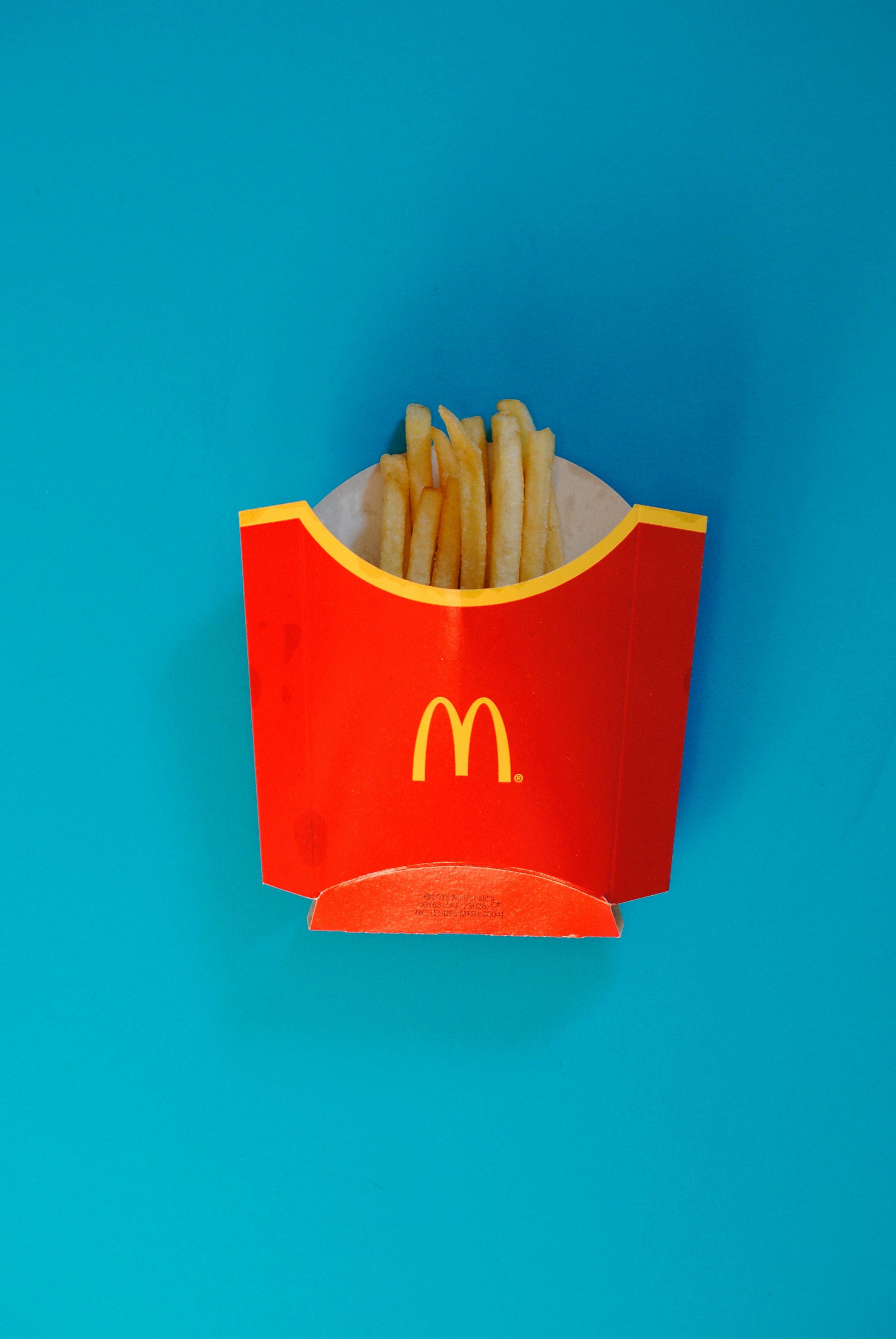
I was thinking recently about the exact color of the red in a McDonald’s fry box. It’s more than just red. It’s a very intentional, energetic signal. If I asked you what color comes up when you think of food, chances are you’d say red or yellow, possibly green if you’re thinking healthy. Purple or black would never occur to you. This is no accident. There is a reason for this based upon how we make decisions and the way brands carefully select colors to create a connection between seeing an ad and wanting to eat.
Many people think of marketing as just slogans or ads. That is only part of the picture. The foundation of all marketing is usually color psychology. It is the non-verbal language that communicates some information to you before you can interact with a product. Color psychology is the science of understanding how various colors affect human behavior and decision-making processes. Often, the choice of color creates a subconscious cue to help you determine how you perceive a company’s image or what a product tastes like before it reaches your mouth.
Color psychology wasn’t invented yesterday. As far back as the early 1800s, Johann Wolfgang von Goethe wrote a book called Theory of Colors. Von Goethe did not simply write about the visual aspects of colors; he also studied their physical effects on motor skills and noted that green and blue had calming effects, whereas red stimulated motor skill activity. A few years later, Carl Jung analyzed the use of color throughout history and felt that there was a kind of code or language that existed in these color selections.

The code exists everywhere. Consider the association between sight and taste. You will immediately assume a purple drink is grape-flavored when you see a deep, rich purple. Your brain has created these associations through life-long experiences. Marketing uses these associations to stimulate certain sensory functions: green suggests fresh products or “healthy tasting”, pink is typically seen as feminine, yellow is full of joy/happiness, and white represents purity.
Red gets more complicated here — particularly in the food industry. Red carries numerous sensory characteristics: power, excitement, rapidness, and hunger. When looking at the McDonald’s color palette, both red and yellow were intentionally selected together. While red stimulates appetite and causes activity, yellow produces feelings of happiness and warmth towards the consumer. There has been one major theory regarding why McDonald’s chose these two colors: to excite consumers, feed them quickly, and move them along—the core model for fast food.
We tend to feel that we are resistant to this influence. However, this is where the distance between perception and actual response begins to shrink. You may note a billboard due to its brightness, but ultimately respond to it due to the fact that the color has signaled to your brain that it will satisfy your need.

Consider the Jersey Mike’s Subs branding. Their deep red (#DA291C) is combined with a unique blue (#1B365D). The red continues the stimulating effect on appetite that was established previously. However, the blue provides a level of trust and tradition to reinforce their “sub above” heritage. It seems much more down-to-earth compared to neon-painted fast-food chains offering low-cost menu options. Next, consider Popeyes, whose branding is dominated by an intense orange (#FF7D00). Orange is interesting since it combines the energy of red with the optimism of yellow and therefore represents value and friendly service, which aligns well with their brand identity.
A great number of companies fail with respect to choosing colors because they want a palette that looks attractive rather than realize they could be signaling contradictory messages to consumers’ brains. If a company wishes to establish trust yet employs colors that clearly communicate temporary or low-quality goods, there is friction preventing a consumer from taking further steps.
As Paul Findley, a contributor for Mumbrella, explored in his breakdown of the “Ketchup and Mustard Theory” of advertising, we have to learn how to “taste” a brand with our eyes. This reinforces the idea that humans are continuously influenced by environmental stimuli—whether we’re instinctively avoiding a brightly colored poisonous animal in nature or choosing the color of the car we drive.
Marketers who successfully utilize color psychology do more than just grab your eye with a flash of bright pigment; they provide an immediate, subconscious sense of clarity. They aren’t just shouting for attention; they are telling you exactly what to expect before you even read a word of copy.
When the color used reinforces the promise made by the product, the uncertainty surrounding purchasing diminishes. Consumers no longer focus on completing transactions and begin thinking about sensations related to the product purchase experience. It’s a reminder that we aren’t just buying a meal; we’re responding to a visual language that knew we were hungry before we did.c
Leave a Reply